The Test Shots:
Thursday, 16 December 2010
Test Shots (Piano Playing)
My media partner and I decided to do some test shots for the piano playing with our second main cast star, Emma Harrison. This was to establish how she would play, and to put our storyboard slightly into practise while we wait for our dance cast to choreograph a dance to the song. (We emailed them the song and lyrics).
Animatic Storyboard
This is our animatic storyboard, which shows what we produced to show what we plan to create, regarding timing of the shots, shot angles, etc.
This was a very time-consuming task to do, but it proved effective in the end, as it gave my media partner and I a good idea and feel for how we wish to film our music video. It also acts as a good production sample for our cast members.
Here is our storyboard:
This was a very time-consuming task to do, but it proved effective in the end, as it gave my media partner and I a good idea and feel for how we wish to film our music video. It also acts as a good production sample for our cast members.
Here is our storyboard:
Monday, 13 December 2010
Meeting With Music Video Cast
As scheduled under our list of jobs that we must carry out as part of our planning for our music video, my media partner and I held a meeting (on Tuesday 7th December) with the dancing cast and the main star (who will mime the song lyrics).


This girl is named Emma Harrison, and she is the second main star in the music video, as she is the person who shall be pretending to play piano. We decided that she was suitable for the part because she is already Grade 7 in piano, and therefore shall play it very realistically along to our artist's song. She is photogenic and so therefore shall make the shots look very good when shooting.


These cast pictures underneath are of the dance crew who shall be performing in front of the cameras for us, to our artist's song. We chose these people because they are experienced dancers.


The rest of the cast that we need to use are of a group number around 49, so because of the enormity of this group, it was impossible to gather everyone to take photos. However, my media partner and I created a Facebook group for the rest of the cast (who shall run around the streets dancing along with Rory) throughout the music video, building up to the climax.
Here is the group:
 This next screen shot is of me explaining to our group members what is required of them in the music video. I find that making these groups on Facebook are extremely useful and important, because we can constantly update our group members as to what is going on with the arrangements for when everything regarding our music video is taking place, and our members can contact us, etc.

In the meeting we discussed:
- The schedule dates regarding the choreography preparation, rehearsals and filming.
- Who will do what - (we concluded that the dancers will choreograph their own dance to the song).
- Where the filming shall take place, and how many people shall be involved.
- How the storyboard shall work with the music.
- What to wear on set, etc.
- Exchanged phone numbers, emails, etc.
I feel that this was overall a very successful meeting.
Here are the casting photos (of who shall be involved in our music video):
This is a picture of the main star, who is called Rory Howes. He shall be the person who mimes along to the voice of the song, and shall be the main concept portrayed in front of the camera. We decided that he was appropriate for the part because he is an extremely cheerful person and has great experience in acting and being on the stage, so we therefore know that he shall be a very reliable person to put on a great performance in front of the camera. Also, because of his amazing personality, we know that it shall be very easy and enjoyable to work with him.
This is a picture of the main star, who is called Rory Howes. He shall be the person who mimes along to the voice of the song, and shall be the main concept portrayed in front of the camera. We decided that he was appropriate for the part because he is an extremely cheerful person and has great experience in acting and being on the stage, so we therefore know that he shall be a very reliable person to put on a great performance in front of the camera. Also, because of his amazing personality, we know that it shall be very easy and enjoyable to work with him.


This girl is named Emma Harrison, and she is the second main star in the music video, as she is the person who shall be pretending to play piano. We decided that she was suitable for the part because she is already Grade 7 in piano, and therefore shall play it very realistically along to our artist's song. She is photogenic and so therefore shall make the shots look very good when shooting.


These cast pictures underneath are of the dance crew who shall be performing in front of the cameras for us, to our artist's song. We chose these people because they are experienced dancers.


The rest of the cast that we need to use are of a group number around 49, so because of the enormity of this group, it was impossible to gather everyone to take photos. However, my media partner and I created a Facebook group for the rest of the cast (who shall run around the streets dancing along with Rory) throughout the music video, building up to the climax.
Here is the group:


Artist Advert Process
As part of our production creation, we had to made an advert for our band which would be advertised in a magazine.
In the process of this, we had to take into consideration the size that the advert would be in the magazine, based on how big our band is and what they could afford. Therefore, I decided to make a advert which would take up half a magazine page, because the artist who I am promoting is not a modern, extremely popular singer - as he is aimed at an older target audience, and therefore would only afford half page (also taking into consideration that much of the ink in this advert is black - which is most expensive).
The Designing Process:
Firstly, I had to find out the measurements of an A4 page, in order to process these measurements into Photoshop. I then halved it so that my poster would take up half a page.
 The next step was to find the right font which would catch my target audience's attention and sell the CD name and artist.
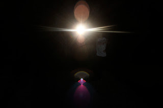
 I then took an image of extreme light which I had taken at night with my friend holding an extremely bright torch. I made the exposure on the SLR (which I took the photo with) extremely low so that I captured only the essence and brightness of the light. I thought that photo was good for connotating religious ideas, and also the atmosphere of the song.
 I then tried making the advert as plainly as possible, in order to be able to focus on the detailing for the poster, regarding the font, information, etc.
 I then added another photo onto the layout that I now had for my artist advert, because I decided that it needed something extra to stand out. Therefore, on a cloudy day, I went outside and took some photos of the clouds, thinking carefully how to frame them. I then brought it onto Photoshop and changed the tone to Sepia, but also adjusted the contrast and shadowing, to make the clouds shape nicely. I also thought that the clouds connotated the symbols of the song very clearly, (regarding religious ideas, and also of the lyrics themselves).
 After this preparation, I then went onto adding this image to my advert that was in the making. I added another layer on Photoshop, and dragged this photo over the top of the original poster that I had made, with the simple black background. Once I had dragged the image of the clouds over the top of what I had already created, I then used the 'rectangular markee tool' to select a rectangular shape around the writing which I had made on the layer underneath, and then selected cut, and dragged it away, leaving a section of the previous writing to show.
 This was the outcome which at first I thought would be the final development. However, after showing it to my target audience, I decided to go by their constructive criticism and exchange the light for a sparkler, which would link with my digipak design. Therefore, I proceeded onto making further alterations for the advert.
 The Final Artist Advert Outcome:
I was happy with the outcome of this, because I feel that it is extremely suitable for capturing the attention of my target audience, who are middle class 28-48 year old's and may have religious faith. I am also happy with it being half a page worth, because this what I feel my artist could afford, as he is not a hugely worldwide known singer/songwriter. I also feel that the black ink cost would be considerably high, which can be manageable by having a half a page to advertise with, instead of a full page. The message "Available on iTunes and all good record stores" is written in that manner because it is an older audience who are to be reading this, and so I would not advertise that it is available in HMV, because some of my audience may not know what that is. I feel that the light and clouds connote the messages and values of the artist very clearly, which also helps to attract the attention from my desired audience. The ratings that I added, which are from magazines that have religious qualities and the same target audience add to the realism. I also prefer the sparkler background instead of the light rays, because this version is more original and does not completely play up to the expectations that the audience my aimed type would expect.

In the process of this, we had to take into consideration the size that the advert would be in the magazine, based on how big our band is and what they could afford. Therefore, I decided to make a advert which would take up half a magazine page, because the artist who I am promoting is not a modern, extremely popular singer - as he is aimed at an older target audience, and therefore would only afford half page (also taking into consideration that much of the ink in this advert is black - which is most expensive).
The Designing Process:
Firstly, I had to find out the measurements of an A4 page, in order to process these measurements into Photoshop. I then halved it so that my poster would take up half a page.


I was happy with the outcome of this, because I feel that it is extremely suitable for capturing the attention of my target audience, who are middle class 28-48 year old's and may have religious faith. I am also happy with it being half a page worth, because this what I feel my artist could afford, as he is not a hugely worldwide known singer/songwriter. I also feel that the black ink cost would be considerably high, which can be manageable by having a half a page to advertise with, instead of a full page. The message "Available on iTunes and all good record stores" is written in that manner because it is an older audience who are to be reading this, and so I would not advertise that it is available in HMV, because some of my audience may not know what that is. I feel that the light and clouds connote the messages and values of the artist very clearly, which also helps to attract the attention from my desired audience. The ratings that I added, which are from magazines that have religious qualities and the same target audience add to the realism. I also prefer the sparkler background instead of the light rays, because this version is more original and does not completely play up to the expectations that the audience my aimed type would expect.

Friday, 10 December 2010
Final Digipak Process
I took my previous research into digipaks very seriously and kept referencing back to it when I was designing my final version; as I knew that using real digipaks for inspiration and guidance would help to make my own final digipak look very realistic and professional.
I developed my final idea from the last design plan which I previously came up with, regarding the sparkler in the jar. After all of the planning and designing which I had undertaken, I realized that I was really favouring the idea of using the theme of 'light' throughout my work. Firstly, this was because the concept of 'light' had good links to the connotations which my target audience would expect to see in the promotion for my artist, Chris Eaton, and it secondly was because I could make my product appear really catchy and attention grabbing this way.
The Photoshoot (1)
These are examples from the first photoshoot which I did for my digipak, using inspiration from my research and sketches. I put a set of fairy lights into a glass jar, balanced on top of a keyboard, and I then sprinkled the 'set' with glitter and small silver balls to 'glamour' up the appearance of the image in the camera.


The Photoshoot (2)
The second photoshoot was based on sparklers. I took this photoshoot in the kitchen, with a member of family holding the sparklers. When taking the photo, I used a non-flash setting so that the light ignited from the sparkler was extremely bright, and so that the background behind it would be black. This all worked effectively, but I just had to make sure that held the camera still.


The Photoshoot (3)
This third photoshoot was based on the simple idea of taking photos of candle's flame. This felt effective to me, because of how close I got the camera to the light which was emmitted.


The Editing Process
Once I had my photoshoots completed, I then went on to edit together my digipak, following my rough sketched plan, and constantly referring to my previous research and planning.
This is a screenshot of how I got the colouring right for the tile, because I needed to make sure that it stood out against the 'sparkler' background. The layers came in very helpful for completing this digipak. I made sure that I lowered the opacity on the 'sparkler' layer to about 90% so that it was less bright, therefore making the title bolder.


When creating the back panel, I needed to make sure that I added both a bar code and copyright detail in order to make the whole digipak look professional and realistic.


The Final Digipak Outcome:
This is the result for my digipak design. I think that the research and planning helped tremendously to make this work effectively and as realistically as possible. The quote "when was the last time... you did something for the first time?" deemed as significant to put in the middle opening panels to me, because they coincided very well with the overall title of the digipak - "Dare To Dream." I think that the candles, sparklers and fairy lights all linked together better than I had hoped, because it all promotes the theme of "light" which sells the artist's messages and values well to the older target audience. I think that there is sophistication in this digipak which also promotes itself well to the right audience.

Wednesday, 1 December 2010
Further Digipak Planning
I have already researched into digipaks, and analysed them in depth, but now my next focus is to successfully create my own digipak.
From previous research, I have found that the sides of a digipak are generally 12cm x 12cm.
I searched on Google to find a template of a digipak which included measurements. This is what I found. Here, the measurements are slightly off my previous findings of 12cm x 12cm, but that is expected as not every single digipak is going to be the same.
 OR:
OR:
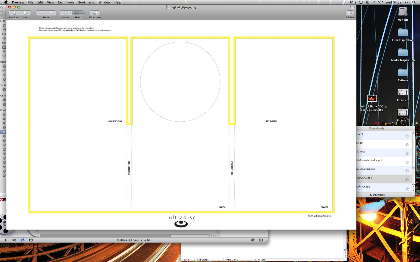
 What I knew that I really needed next was a template for a 6 panel digipak, so I searched through Google once more, and found this site:
http://www.benchmarkmultimedia.com/templates.html


From previous research, I have found that the sides of a digipak are generally 12cm x 12cm.
I searched on Google to find a template of a digipak which included measurements. This is what I found. Here, the measurements are slightly off my previous findings of 12cm x 12cm, but that is expected as not every single digipak is going to be the same.


http://www.benchmarkmultimedia.com/templates.html
The problem with this website was that the 6 panel digipak template here was very rectangular.
However, I finally found the perfect template layout, which is also set to the perfect proportions, which help from my teacher.
This is the template which I shall use:
Inspirational Photos
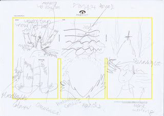
In order to create my drawn out drafted plans for my digipak, I am going to come up with a variety of ideas which are pulled from inspiration which I have searched for.
Although I have already gathered photos in previous blogs, which inspire me with ideas for my own digipak design, here are some more, which have been found from a photo-blog site called Tumblr:
Draft Idea 1:
(Inspiration Section)
"The Rain"
From this photo I have taken inspiration to have a dark, miserable rainy day as a main setting for each panel on the digipak. I would then get some people in brightly coloured outfits to start dancing around in front of the camera. This would connote happiness and 'unity' which is part of the main message we want to convey in the music video - as it is very suiting to the song.

(Sketch Draft Section)

Draft Idea 2:
(Inspiration Section)
"Cut Out"
This photo has generated an idea for a whole theme which I could spread across all of my digipak panels. I like the way that there are different tones of light which shine through the cut out letters in the black paper. I feel that it would suit the "Dare to Dream" title, if I made something similar, but with my own creative input added.

(Draft Sketch Section)

Draft Idea 3:
(Inspiration Section)
"Sunrise on Body"
This image struck me because I found the different lighting tones and objects worn on the girl very interesting. I felt that attention to detail was paid to greatly here.

(Draft Sketch Section)

Draft Idea 4:
(Inspiration Section)
"The Sparkly Jar"
This image stands out to me greatly because of the way that it glows amongst all of the interesting items which are in the jar. I also think that it connotes and links in well with the messages and values which I am trying to present with my artist.
(Draft Sketch Section)

Subscribe to:
Posts (Atom)