CD Digipak Analysis (of a similar genre to my own)
Website findings reference:
http://www.allcdcovers.com/find/music/albums/new
Shakira - Donde Estan Los Ladrones? (1998) Retail CD
This digipak fits well with Shakira's genre of music, as the design expresses her niche and who is she is about. This cover is constructing a brand image of Shakira being innocent, because there is no exposure or revealing clothes being worn. The themes/colors/typography match on each side of the digipak, including the CD. This is what I need to take note on for my own digipak design. This digipak is likely to appeal to its target audience because the theme matches the music type which she has always produced, clearly, it is targeted at a young adult audience, consisting of females.
Stereophonics - Just Enough Education To Perform (11 Tracks) (2001) Retail CD
This digipak is different to the previous because there are no photos, only drawings and graphics. However, this still makes the digipak effective because of the way that it's been carried on, onto each side - which makes it become a key concept/theme for the pack. It reaches out to Stereophonic's target audience (of 17-28 year olds), as their genre is alternative rock, and I feel that this digipak's design portrays this well. I also feel that this is what the target audience's age range would appeal to. The pack's typography/theme/colours, etc... maintains the band's image because it portrays their genre well and signifies an atmosphere about their music and lyrics.
Inside Again - End Of The Beginning (2010) Retail CD
The digipak for this band 'Inside Again' portrays the genre of their music clearly, which is in fact progressive rock/metal.. Even though this is not the same genre as to what my music video/digipak shall be, I thought that the digipak was effective in the way that it's style is the most consistent and stays the most true throughout many other digipaks I have researched. I have learnt something from analyzing this digipak: that the colouring is what connotes the genre of the band's music the most, which would instantly attract its target audience (of young adults, being mostly men). This digipak is maintaining and constructing a brand image through the detail behind the colour co-ordination/typography/photos of the band etc...
Magazine Advert Analysis
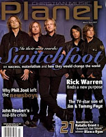
 This magazine is aimed at a mature audience (20-48 year olds), those of which between A and C1 on the Jicnar's scale. The artists within this magazine would be aimed at around the same genre as my chosen artist. The cover, for example constructs and maintains the band image, by showing that they are a serious band, most likely conducting a christian/pop genre... the concept of the band is implicated through the style of typography, colour choice and the camera shot/angle that the band is focused in. This would be a good magazine choice to have my advert in
 This music advert is from a magazine, but it appears to be under the same type of genre as what my artist's music shall be - the lighting of the photograph, and the way it is edited regarding the coloured/sepia effect helps connote this, as well as with the use of the typography, and the way that the title is centered in the middle of the advert. The band advertised in this advert though however, are obviously able to afford a full page advert, which would cost around £200, but if this was put into a lot of magazines then it would truely add up. However, I like the simplicity in this advert, and it would be aimed at the same target audience age range as mine, because it has the same type of design layout that I've been finding occur in a pattern, aimed at my specific target audience. This advert also shows that it's of a classical genre, possibly, because of the peaceful photo and the way the colours are altered to.


No comments:
Post a Comment