In the process of this, we had to take into consideration the size that the advert would be in the magazine, based on how big our band is and what they could afford. Therefore, I decided to make a advert which would take up half a magazine page, because the artist who I am promoting is not a modern, extremely popular singer - as he is aimed at an older target audience, and therefore would only afford half page (also taking into consideration that much of the ink in this advert is black - which is most expensive).
The Designing Process:
Firstly, I had to find out the measurements of an A4 page, in order to process these measurements into Photoshop. I then halved it so that my poster would take up half a page.
The next step was to find the right font which would catch my target audience's attention and sell the CD name and artist.
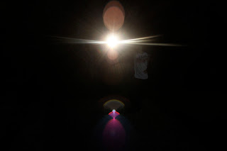
I then took an image of extreme light which I had taken at night with my friend holding an extremely bright torch. I made the exposure on the SLR (which I took the photo with) extremely low so that I captured only the essence and brightness of the light. I thought that photo was good for connotating religious ideas, and also the atmosphere of the song.
I then tried making the advert as plainly as possible, in order to be able to focus on the detailing for the poster, regarding the font, information, etc.
I then added another photo onto the layout that I now had for my artist advert, because I decided that it needed something extra to stand out. Therefore, on a cloudy day, I went outside and took some photos of the clouds, thinking carefully how to frame them. I then brought it onto Photoshop and changed the tone to Sepia, but also adjusted the contrast and shadowing, to make the clouds shape nicely. I also thought that the clouds connotated the symbols of the song very clearly, (regarding religious ideas, and also of the lyrics themselves).
After this preparation, I then went onto adding this image to my advert that was in the making. I added another layer on Photoshop, and dragged this photo over the top of the original poster that I had made, with the simple black background. Once I had dragged the image of the clouds over the top of what I had already created, I then used the 'rectangular markee tool' to select a rectangular shape around the writing which I had made on the layer underneath, and then selected cut, and dragged it away, leaving a section of the previous writing to show.
This was the outcome which at first I thought would be the final development. However, after showing it to my target audience, I decided to go by their constructive criticism and exchange the light for a sparkler, which would link with my digipak design. Therefore, I proceeded onto making further alterations for the advert.
The Final Artist Advert Outcome:
I was happy with the outcome of this, because I feel that it is extremely suitable for capturing the attention of my target audience, who are middle class 28-48 year old's and may have religious faith. I am also happy with it being half a page worth, because this what I feel my artist could afford, as he is not a hugely worldwide known singer/songwriter. I also feel that the black ink cost would be considerably high, which can be manageable by having a half a page to advertise with, instead of a full page. The message "Available on iTunes and all good record stores" is written in that manner because it is an older audience who are to be reading this, and so I would not advertise that it is available in HMV, because some of my audience may not know what that is. I feel that the light and clouds connote the messages and values of the artist very clearly, which also helps to attract the attention from my desired audience. The ratings that I added, which are from magazines that have religious qualities and the same target audience add to the realism. I also prefer the sparkler background instead of the light rays, because this version is more original and does not completely play up to the expectations that the audience my aimed type would expect.


No comments:
Post a Comment