I took my previous research into digipaks very seriously and kept referencing back to it when I was designing my final version; as I knew that using real digipaks for inspiration and guidance would help to make my own final digipak look very realistic and professional.
I developed my final idea from the last design plan which I previously came up with, regarding the sparkler in the jar. After all of the planning and designing which I had undertaken, I realized that I was really favouring the idea of using the theme of 'light' throughout my work. Firstly, this was because the concept of 'light' had good links to the connotations which my target audience would expect to see in the promotion for my artist, Chris Eaton, and it secondly was because I could make my product appear really catchy and attention grabbing this way.
The Photoshoot (1)
These are examples from the first photoshoot which I did for my digipak, using inspiration from my research and sketches. I put a set of fairy lights into a glass jar, balanced on top of a keyboard, and I then sprinkled the 'set' with glitter and small silver balls to 'glamour' up the appearance of the image in the camera.


The Photoshoot (2)
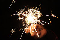
The second photoshoot was based on sparklers. I took this photoshoot in the kitchen, with a member of family holding the sparklers. When taking the photo, I used a non-flash setting so that the light ignited from the sparkler was extremely bright, and so that the background behind it would be black. This all worked effectively, but I just had to make sure that held the camera still.

The Photoshoot (3)
This third photoshoot was based on the simple idea of taking photos of candle's flame. This felt effective to me, because of how close I got the camera to the light which was emmitted.
The Editing Process
Once I had my photoshoots completed, I then went on to edit together my digipak, following my rough sketched plan, and constantly referring to my previous research and planning.
This is a screenshot of how I got the colouring right for the tile, because I needed to make sure that it stood out against the 'sparkler' background. The layers came in very helpful for completing this digipak. I made sure that I lowered the opacity on the 'sparkler' layer to about 90% so that it was less bright, therefore making the title bolder.
When creating the back panel, I needed to make sure that I added both a bar code and copyright detail in order to make the whole digipak look professional and realistic.
The Final Digipak Outcome:
This is the result for my digipak design. I think that the research and planning helped tremendously to make this work effectively and as realistically as possible. The quote "when was the last time... you did something for the first time?" deemed as significant to put in the middle opening panels to me, because they coincided very well with the overall title of the digipak - "Dare To Dream." I think that the candles, sparklers and fairy lights all linked together better than I had hoped, because it all promotes the theme of "light" which sells the artist's messages and values well to the older target audience. I think that there is sophistication in this digipak which also promotes itself well to the right audience.


No comments:
Post a Comment