From previous research, I have found that the sides of a digipak are generally 12cm x 12cm.
I searched on Google to find a template of a digipak which included measurements. This is what I found. Here, the measurements are slightly off my previous findings of 12cm x 12cm, but that is expected as not every single digipak is going to be the same.
OR:
What I knew that I really needed next was a template for a 6 panel digipak, so I searched through Google once more, and found this site:
http://www.benchmarkmultimedia.com/templates.html
The problem with this website was that the 6 panel digipak template here was very rectangular.
However, I finally found the perfect template layout, which is also set to the perfect proportions, which help from my teacher.
This is the template which I shall use:
Inspirational Photos
In order to create my drawn out drafted plans for my digipak, I am going to come up with a variety of ideas which are pulled from inspiration which I have searched for.
Although I have already gathered photos in previous blogs, which inspire me with ideas for my own digipak design, here are some more, which have been found from a photo-blog site called Tumblr:
Draft Idea 1:
(Inspiration Section)
"The Rain"
From this photo I have taken inspiration to have a dark, miserable rainy day as a main setting for each panel on the digipak. I would then get some people in brightly coloured outfits to start dancing around in front of the camera. This would connote happiness and 'unity' which is part of the main message we want to convey in the music video - as it is very suiting to the song.
(Sketch Draft Section)
Draft Idea 2:
(Inspiration Section)
"Cut Out"
This photo has generated an idea for a whole theme which I could spread across all of my digipak panels. I like the way that there are different tones of light which shine through the cut out letters in the black paper. I feel that it would suit the "Dare to Dream" title, if I made something similar, but with my own creative input added.
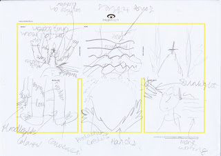
(Draft Sketch Section)
Draft Idea 3:
(Inspiration Section)
"Sunrise on Body"
This image struck me because I found the different lighting tones and objects worn on the girl very interesting. I felt that attention to detail was paid to greatly here.
(Draft Sketch Section)
Draft Idea 4:
(Inspiration Section)
"The Sparkly Jar"
This image stands out to me greatly because of the way that it glows amongst all of the interesting items which are in the jar. I also think that it connotes and links in well with the messages and values which I am trying to present with my artist.
(Draft Sketch Section)


No comments:
Post a Comment